GALLERY | Images revealed of next Renaker tower
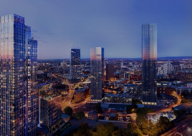
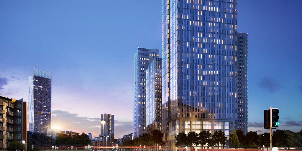
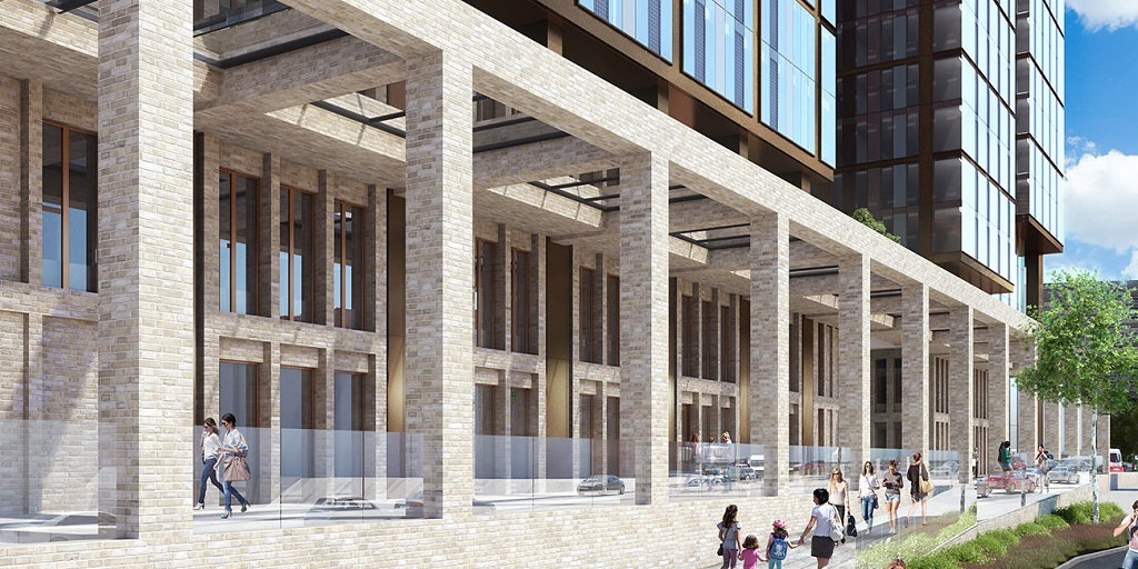
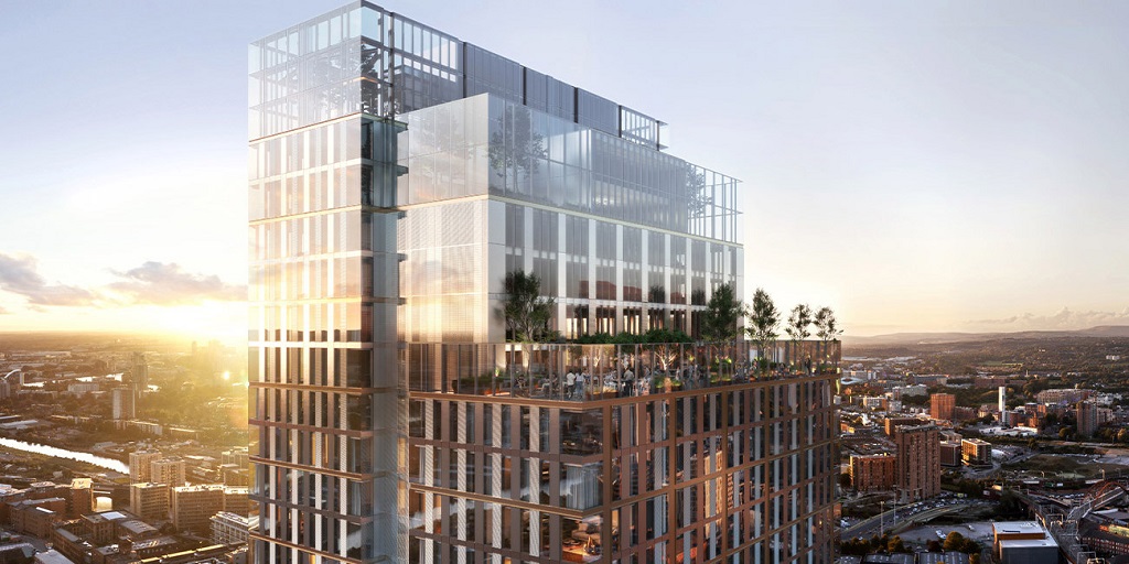
New renders have been made available of Renaker and Select Property Group’s 52-storey Elizabeth Tower in Manchester, designed by SimpsonHaugh.
Place North West reported last month that the two developers had teamed up on the Crown Street development, for which planning consent was secured this summer, with enabling works started in August. Images now present on the project’s website show further detail on how the completed development will look.
Select is to drive marketing and international sales for the project, with Renaker delivering on construction and development.
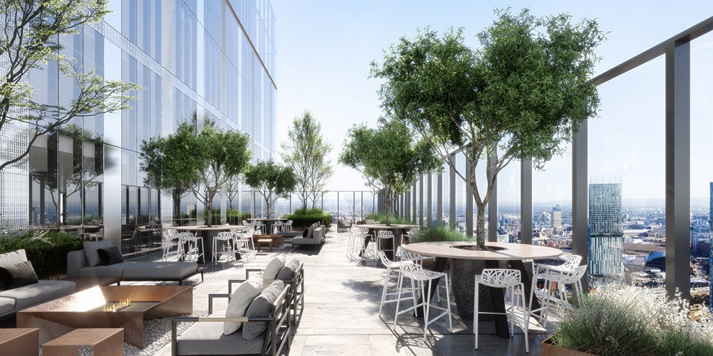
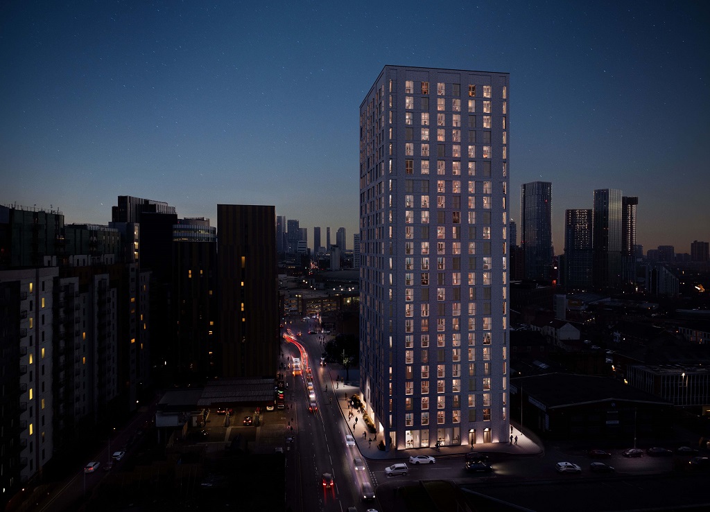
Now named Elizabeth Tower, the building totals 484 apartments, and is set to be built next to a 21-storey block, in total delivering 664 flats. Facilities available to residents will include a gym, rooftop gardens, a pool on the 44th floor, and 24-hour concierge.
The project sits within Manchester’s Great Jackson Street framework area, which is effectively earmarked for tall residential development, also including Renaker’s Deansgate Square scheme.
The partnership between the two active Manchester developers was revealed in September as the flats were launched for sale internationally via Hong Kong sales agent Ashton Hawks, offering an estimated 7% gross yield to potential buyers.
Renaker, established in 2006 by ex-Laing O’Rourke man Daren Whitaker, has established a reputation for its ability to deliver large-scale residential buildings, with the first towers within its 1,500-apartment Deansgate Square project at nearby Owen Street closing in on completion.
Select has progressed various projects in Manchester and beyond under a suite of brands, with Vita covering luxury student accommodation, Affinity delivering PRS and CitySuites operating aparthotels. It has also now launched the Origin residential brand and a division to focus on food & beverage at its developments.
Click any image to launch gallery
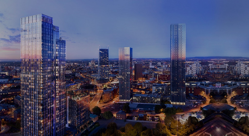
- Image shows Elizabeth Tower in foreground, with Deansgate Square to the right and Beetham Tower to the rear




Looks incredible, the best one yet.
By York Street
Very nice indeed! This area is going to be amazing when finished
By Steve
Wow.. it looks…… just like everything else SimpsonHaugh have designed.
By TDIZZLE
Looks sensational! This part of the city is v exciting.
By Fariplay
Variety is a key part of what makes places and cities interesting. However good they are individually, its not a good thing to have a city full of identikit fully glazed SimpsonHaugh towers.
By hmmmm
I’m so bored of Simpson’s glass rectangles. Maybe one day some real architects will get a look in. I’ve always hoped Norman Foster might like to design something special for his native city.
By Mancunian
Is a 52 storey tower really appropriate in this location. It sits South of the Castlefield conservation area and urban heritage park so will really overshadow this area.
By PDes
I like the roof. Not sure about the name. I am presuming it is named after the Queen?
By Elephant
why is everything mirrored on the right hand side of the main visual?
By Anonymous
Everything is mirrored on the right hand side so they can pretend Hulme doesn’t exist.
A better question might be why do all the towers appear to be mirrored. At this point I can only assume Ian Simpsons keyboard only has the ‘Ctrl’,’c’ and ‘v’ keys.
By Bored Engineer
@Hmmmm – Might want to look at the skyline of our capital mate… You’ll rapidly reevaluate the idea that variety is a good idea on the skyline.
Though I appreciate the point your making, and I do agree – We should just rename Manchester to Hough-chester.
Also, weird they’ve chosen to create renders which do not show a complete Deansgate Square.
By Daveboi
If we can’t build towers close to residential areas or close to listed buildings or close to heritage areas or close to parks then we can’t build them anywhere, that’s the whole of Manchester.
By Fruit
Look amazing. Love them.
By Derek
A huge glass and steel box, just like thousands of others. Nice views for the residents; everyone else will have to live in its shadow; every building around it will be diminished by its presence. Arrogant, boorish, oversized and dehumanising. 4/10.
By Moomo
dont like it
By Roger Scruton