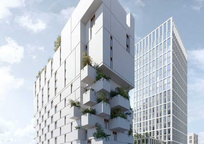
Capital & Centric combats ‘bland’ designs with Leonardo Hotel
Plans for a residential-led district near to Piccadilly station have moved forward with Capital & Centric’s submission of a planning application for a 275-bedroom Leonardo hotel on Adair Street.
The proposal includes a public square, restaurant and bar.
The 110,000 sq ft hotel, designed by Stephenson Studio, will be located on the corner of Adair Street and Great Ancoats Street and will reach up to 13 floors. As part of the design of the Jenga-inspired building, planters will be situated down one side to create a trail of greenery from the roof down to the street. Re-form advised on the landscaping.
Capital & Centric bought the plot on the corner of Adair Street and Great Ancoats Street in 2018 from a private vendor for around £2m. The site is near the developer’s Crusader Mill residential scheme, and London Warehouse, a multi-million pound refurbishment of the former Place aparthotel, delivered in partnership with Native.
The hotel falls within the Portugal Street East regeneration framework. Other projects coming forward include Olympian Homes and Aecom’s proposals for two towers targeted at the PRS sector, designed by Jon Matthews Architects, and a 23-storey residential block from Forshaw Land & Property, designed by SimpsonHaugh. Another building sited in the SRF zone is Aeroworks, an office owned by Epsilon Real Estate and recently fully let to On The Beach.
Both Forshaw and Olympian have submitted planning applications for their schemes, but Manchester City Council held off progressing the proposals until all developers could agree on a plan for delivering and maintaining public realm. Transport for Greater Manchester, the council, and KM Print Design are also landowners around Portugal Street East.
Details on a joint planning application for the public realm are set to appear in the coming weeks.
Speaking about the Leonardo Hotel proposals, Adam Higgins, co-founder of Capital & Centric, said: “We’ve had an amazing response to the plans – everyone’s loved the eye catching and bold design. We always like to create something interesting and beautiful but we’ve never had such an amazing reaction to the architecture before. I think people have got used to boring, bland, and safe designs, so we’re made up people love it.
“People are crying out for this part of the city to be regenerated. Everyone we spoke to can’t believe it’s been left forgotten for years. Sat right next to Piccadilly the potential around here is huge. This is just the start for us. We’ve big plans for more apartments, offices, hotels and café-bars.
“The Council has put its support behind regenerating this area and creating a new vibrant quarter. We just need to get things moving as people are crying out for it to be shown some love.”
Leonardo is a brand owned by Fattal Hotel Group, and could be open to visitors by early 2021. This marks the Group’s second deal in Manchester following its purchase of the Midland Hotel in October.


Oh dear, what has happened to Stephenson Studio……beyond words!
By Young MC
Visionary stuff for Manchester but it simply won’t age well.
By Tannoy
Love this.
By Liver Dude
Great looking design, but i hope they embrace the greenery even more like Milan’s il Bosco Verticale
By Green
Fantastic! Better than the bland, boring designs that SimpsonHaugh are constantly churning out and ruining the city’s skyline with.
By Anonymous
Has some architect had his kids Lego out?
By Fake News
@Young MC, what are you on about…. This is a fantastic design. Would you rather another featureless box? I cant wait to see this completed.
By Egg
Let’s be honest with ourselves, this is great
By Leon
Terrific.
By Elephant
I like it and don’t like it at the same time… I can’t work it out, its different whihc is certainly refreshing, but seems very little window space. Also that overhang from the bulky top overhang is hardly going to help the greenery the depicted on the balconies underneath. We see so many CGI with all these green roof gardens that very often never come to fruition.
By Zippy
Move of this sort of stuff please
By Paul Smith
Looks great we need more developments of this standard.
By Lenny1968
Problem is; bland designs usually get built. Ego schemes flop.
By Practical
Although I admire taking the chance, i’m not convinced. The image is a distorted perspective that makes it look more dynamic than it actually is and if you look closer it’s pretty crude so far- will be in the detail and please not render!
By Graham
Great design but not sure it’s in the right location. Would look superb in the centre of town somewhere to create a complete contrast. Maybe where the hideously designed Hotel Brooklyn is going on Portland St
By Steve
Take away the planting and it looks very brutal. Hope they get the detailing right. Fair play for thinking outside the box!
By NT
Egg….Please explain to me why this is good architecture? It looks a bit Pt2 to me….
By Young MC
Are those cantilevers just to hold some greenery? I can’t see them surviving the value engineering if that’s the case. Otherwise, these are balconies and the applicants should illustrate this building without the planner-pleasing shrubbery.
By Eileen Clutterbuck
This scheme looks SICK.
This better get built or I’ll be mowing people down.
By Sally the skank